

1. What was the brief from the client? And how did you achieve the same intertwining of your style?
The design brief was inclined towards redefining the retail experience of the renowned brand, to give a fresh aesthetic for its first post-pandemic store. The design language was weaved into the space such that it brought people out of the COVID gloom to reminisce and embrace the social spirit that marked the very ground for spaces in hospitality and retail. The emotive touch of the color palettes, the immersive aura of the material moodboards and the thoughtful composition of all of the space was made such that people saw Anand Sweets as a place to unwind and fade into.

2. With evolving trends, which design trend have you absorbed into this project?
The design style adapts a playful mix of eclecticism and maximalism to discover the celebrative and emotive character of spaces. A tasteful assortment in the moodboard reflects the deep-rooted sentiments behind the sweet delicacies from the brand–something that we Indians have treasured as a part of our culture, across time.
3. What are the environment-friendly initiatives taken for this project?
To resonate with the learnings from the post-pandemic life and its take on hospitality design, the project makes more room for greenery and makes it an intrinsic part of the space–as an element that sparks positivity in the ambience. The sensorial character of the greens also come in line with the same thought to keep the space alive and amicable.As a design element, these green pockets are seen dotting the linear stretch of the space as aesthetic partitions lining the diners. They seamlessly blend into the space, in a way that they don’t outweigh the style but still contribute a fair share to the look and feel of the space.

4. Can you give us insights on the selection of furniture and finishes of the project?
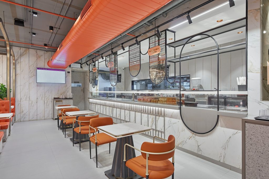
The idea behind the furnishings and finishes of the project is drawn out of its call for positivity, vibrance and a natural splash of energy. This is where the rich contemporary signature comes in with the stripe statement of the slatted walls, tapering silhouettes of the tables and arciform curvature of the frames, to give a fresh twist to the regularities of furnishings. The bespoke character of the furniture language allows more of expetimentation in terms of both materials and build–the mixed media palettes of marble and polished gold define the tables while the upholstered tufts and mosaic strike a contrast in the seaters, to underline the plush and playful experientiality of the space. While this language goes on in the dining zone, the retail part chooses to delve into the sophistication of glass and elegance of gold-toned metal that become a perfect host for the brand’s delectable offerings.
6. If you had to name the design style used, what would it be?
The design style voices out a language that is close to emotive eclecticism–that is certainly unique to this project–its requirements and brand image. This style yearns to invite people for an immersive experience that translates food as a gourmet affair–something they can relish and revel into.
7. What were the inspirations and key concepts for the development of the project?
The project is inspired by the timelessness of the sweet delicacies, their stance in the Indian culture and how they are always a part of our celebrations. This celebratory character is what the project is developed from, both by design and expression.
8. What is your favorite element of design in the project?
The custom ceiling installation is something we thoroughly loved having as a part of the project. It gave the signature to the brand and layered the functional side of it, in style, so that exposed ceiling not only remained efficient but caught the eye and left everyone unbashed. A select range of profile lights and chandeliers added to the artistry of the rhythmic arches in their design to give a grand entrance to the retail zone and make it stand out.

9. If you had to describe the project in 2-3 words what would it be?
A burst of energy–that’s what we would call it, because that was the entire idea.
10. Explain the use of colors and/or other details to add value to the design.
The design layered it’s visual dialogues such that it was both mindful and free-spirited. This idea came to life with a mix of bolder hints of a radiant tangerine with the warm subdued palettes of wood and cane. Ambient lighting further brought in some white undertones that kept the color theories unrestrained, to achieve the much essential balance, before anything else.