

Commercial Design Magazine, in its very first avatar, hosted its awards at the open lawns of Sofitel BKC on the 15th of December, 2022. The Commercial Design awards 2022 commenced with great awe and success.
Talking about the culmination of the hard work and purpose-driven efforts put in by the nominations, the runner-up of ‘Young Designer of the Year’ award was won by Suparna Ghosh & Jensil John, Forum Architecture.
Project submitted:
- Freeman’s India pvt. ltd.
- Ebullient securities corporate office
- Head office for Panalfa Automotives
- Freeman’s India pvt. ltd.
This project is corporate headquarters for a firm which is the oldest indigenous manufacturer of measuring equipment in India. The firm’s history and legacy are represented through the design of art works including a history wall, a world map and multiple installations in the reception area. The gradations of a measuring tape are further extrapolated along the floor to guide a person from the public to the more private zones inside the office. The design is minimal and clean with a palette of white and greys with a dash of wood. The spaces are segregated crisply but a transparency is maintained throughout the office.

Spatial zoning
The spatial zoning for the office is divided into public, semi-private and private from the entrance along a corridor. Layout of the open workspace is such that the team leaders (or supervisors) are seated in the centre triangular workstation while the rest of the team are along the edge. This way team leaders are closer to the Directors as well as their team which makes communication efficient.
Concepts such as transparency and open plan has been used to reduce the hierarchal structure and create a healthy work environment. The The spaces are also
segregated and categorized according to ceiling material. Workspace area has an open ceiling with corrugated sheets at the bottom of slab and hanging lights from
them.
Reception

The design intent revolves around the company’s ideology and history. Such as the corridor which runs through all spaces have measurement marking on the floor to represent what the company stands for.
Workplace

Layout of the open workspace is such that the team leaders (or supervisors) are seated in the centre triangular workstation while the rest of the team are along the edge. This way team leaders are closer to the Directors as well as their team which makes communication efficient.
The spaces are also segregated and categorized according to ceiling material. Such as workspace area has an open ceiling with corrugated sheets at the bottom of slab and hanging lights from them.
- Ebullient securities corporate office
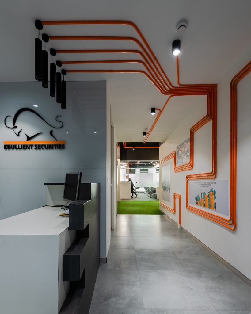
This project is commercial fit out project for a firm which deals with stocks and share markets. The number of people to be accommodated was 100 in a square footage of 2500 which left very little scope of designing the floor plane due to the high density of seats. The project hence aimed at using the ceiling and walls as the main design element enhancing the visual and aesthetic appeal of an otherwise overwhelming space. The spatial configurations were crisp and methodical dividing the staff, breakout, conference into zones. The conduits helped guide a person from the public to the semi public and eventually to the more private spaces of the office.

Context
The site is located on the first floor of a corporate tower in Gurgaon approached from a vertical core and corridor. Large windows for light are available along one length of the site that have been incorporated into the workstation to provide ample light into densely packed workspace.

Design concept

This office deals with trading and share markets so the idea of ‘connectivity’ is key to their
profession. In order to express this in the design of their space we worked with connectivity
represented through a complex network of conducting that forms the main design element of the office. The connections depicted through open electrical conducting run through various circuits in the ceiling finding their way down to the walls and creating a systems of visual and physical connect through the spaces. The lighting and other services are also incorporated into this system to form a holistic design cum service element. Graphics related to the share market were conceived as part of the design to give relief to an otherwise very busy office space in the break-out area and reception.
Graphics and artwork

The graphics and artwork in the office were meant to give relief to an otherwise high stress workspace. An animated type was taken up throughout the office that lightened the mood for the traders and gave a lift to their break time.
- Head office for Panalfa Automotives

The clients brief for designing this office was to create a very formal and corporate space for the top staff of the company, limited to the CEO, MD and 6 accounting staff and secretaries. The purpose of the space was to meet with dignitaries and high officials from the other companies. Only 9 people were to work out of this space.
Location

The site is located as part of a row of shops/houses in a municipal market complex. Located at the G+2 level it receives good light from the north and south faces. As the office was for a company that deals in automobile and parts the design philosophy incorporates the idea of ‘flow’ in both space as well as the main highlight
element.
Given such an exclusive program we realised that while each space needed to be elegant and exclusive the reception and the conference room should be our prime focus of design as the office was primarily meant to receive high profile guests and hold board meetings. The space was linear and narrow so to make it appear less constricted the walls were tilted to create a trapezoidal reception linked to all the other spaces through a dense installation of wooden slats.

Both walls of the reception were given a curved corner with the adjacent corner to create a softer feeling to the otherwise tight space. The remaining look was minimal to offset the one highlighting element of wood. The wooden slats were designed to run horizontally at a constant distance of 4 inches and were given pauses and reliefs to create an interesting pattern that would highlight the walls and create a backdrop for the signage.

Colour palette was kept a subtle white and grey with splashes of wood and veneer thrown in. The client, being an art collector had sent us an inventory of the art work he wanted to incorporate in the office from his home collection. The placements and themes were kept in mind in the process of designing the office. Each space is embellished by an exclusive piece of art keeping the framing of the work and its location of prime importance while conceptualising the spaces.