

Colours & Architectural Design
Colours play a crucial role in our daily lives. We perceive them with the help of our visual senses. Architecture, being related to visual imagery, has a direct relationship with colours. Different kinds of spaces in the built environment employ pertinent colours dictated by a theme, the typology of space, the psyche of the end-users, cultural influences, and other factors. For architects and designers, the function of colours goes far from being a device for decoration. Instead, colours set the personality and mood of the users, acting as tools to interact with their sensory perception, manifesting as an active visual communication device.

Using Colours in Healthcare Design
Healthcare spaces such as hospitals, clinics and wellness centres are sensitive spaces that cater to the ailing and sick. Additionally, caregivers require a conducive environment that facilitates emotional and mental well-being.
Colours, textures and materials are significant catalysts in steering the patients’ experience. These spatial elements can also impact the caregivers’ efficiency and visitors’ experience. Studies suggest that patients prefer lighter hues for their rooms. Natural textures and earthy hues are known to accelerate recovery through psychological means. This colour palette includes neutral and calming colours such as whites and light browns. These colours are often used to imbue a soothing effect on patients, residents and visitors. Similarly, whites, greys and light browns can be employed in various healthcare spaces to radiate a healing effect.
The green colour symbolises health and well-being and is associated with optimism and hopefulness. It also conveys the biophilic nature of human beings, which means staying closer to nature. This colour can elevate the patient and the visitor’s experience when used in healthcare design. The palette can be used in hospital patient wards, corridors, and entrance lobbies with touches of light wood and whites to attain a visual balance.
Apart from green, shades of blue and purple impart a calming experience for users. The cool, muted hues of the two colours are apt for waiting areas, wards, wellness centres etc. However, the calm tone of such spaces needs to be balanced with the warmth of natural wood. Moreover, the areas used by doctors and caregivers for resting should use a strong colour palette that can recharge them after an overworked shift.
During the healing process, a patient is required to move to different spaces within the hospital building. These spaces, along with the transition areas, such as corridors, can be designed to reduce stress and fear-induced intimidation that is typically associated with dull, dim-lit and tight-knit areas. Additionally, patients are in a supine position with their sight on the ceilings most of the time. Therefore, the ceilings must be thoughtfully designed and rendered in calming tones to relax patients.

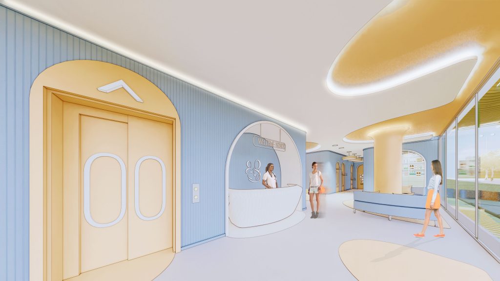
Paediatric hospitals and clinics work for the betterment of children’s health. Since children are more inclined toward vibrant spaces, a paediatric healthcare space should attain a balance between colourful and calming tones. For example, a combination of vibrant orange and calming blue achieves the equilibrium of vivid and soothing interiors. Such a palette projects a playful vibe breaking away from an intimidating clinical environment, especially for young patients.
Healthcare spaces need not create an impression of mundane treatment facilities; instead, they can be calming spaces with an ambience that craft a benign environment. It goes on to show that colour is one of the driving factors that aid in improving healthcare design. With this knowledge in place, healthcare design practitioners can create colour palettes that pave the way for better healing spaces in the built environment.