The clear brief from the client was that the office needs to be something out of the ordinary in terms of design elements, spatial layouts and surface treatments. In keeping with the aspirations of an intrinsically interwoven way of functioning, the aim was to create an office space that not only caters to the needs of different organizational requirements but also fosters a culture of interaction and collective decision making across ages, profiles & positions.
Kunal Sharma, Founder and CEO- Flipspaces.
If you had to name the design style used, what would it be?
We zeroed down on the Eclectic Style of Design as this would be the theme that can encompass a wide range of features co-existing in sync with each other, which is very similar to the layered essence of the design brief received from the client.
What were the inspirations and key concepts for the development of the project?
The key inspirations for this project were the formidable views which in every sense of the term were diametrically opposite to each other. Literally translated into this expression is the presence of a Hill View on the Eastern side & a full scale city view on the Western side. This set the tone for ensuring the fact that no major spans of these views will be denied to any team in the organization. Eventually leading to the Network Operations Centre being housed on the Hill View side with an onus on Focussed approach & the Open office being housed in the urban View side with the city being the perfect backdrop for open discussions & cross departmental coordination.
Explain briefly: spatial configuration and main reasons. How was it accomplished?
Once the views and resultant natural lighting took paramount importance, the way ahead for the zoning was clear. The open office was to get the majority of the Natural light with the biggest span of the office glass facade being dedicated to it. Also the Network operations center occupied the opposite spectrum of this office. This left the entire span of blank walls around the service core of the building, free to be dotted with cabins for the organizational leaders who at all times have a comfortable view of their respective teams and can quickly address them in all scenarios. It was ensured that the Cabin heads are all facing the northern direction in the cabins and also none of the Open Office seats face South (Vastu Compliance). The cabins are interspersed with meeting rooms which ensures that a Meeting space is always available at immediate distances for the leaders and ease of access for the teams.
What were the difficulties, or first setbacks encountered?
The only difficulty faced in the entire process was the finalization of the Future Expansion zone of the office which gradually was placed in an almost unrecognizable span of the office width. Post this the entire process from design finalization to the materials selection & execution was a smooth process due to the clarity and quick decisions on client side.
What were the construction techniques and the principal materials used in the project?
The major construction technique used in this fitout is the dry wall partition system with glass wool provision for sound insulation. The partitions in the meeting rooms have been provided with graphics as well as intermediate acoustical panels merging into the graphic design which helps in preventing sound reverb. The Boardroom has been provided with an acoustical decorative ceiling with light fixtures in a pixelated format. The collaborative pods have been provided with custom made light fixtures. One of the biggest visual features of the design is the powder coated aluminum profile glass partition provided for all the cabins which due to its added non-linear flow gives an external street effect to the main corridor.
Explain the use of colors and/or other details to add value to the design.
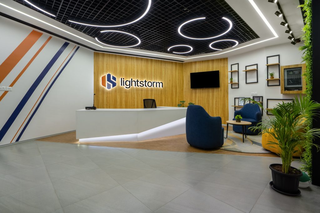
The usage of colors in this project has mainly been in the Colour Pop pattern. This leads to the usage of different elements as a color highlight, with the poofs being the color highlights in reception, whereas the back wall being the color highlight in the cabin. The open office is plugged with coloured MS Screens on the passage borders which gives a kaleidoscopic effect when the open office is viewed from the passage side.
What is your favorite element of design in the project?
Our favorite element of design in the project is the designer storage that has been provided in each of the Director Cabins which gives a unique look & feel to the entire space with its dynamic form and customisable quality because of its highlighted shelves which shares the backdrop shade with the backdrop wall. The glimpses of this element collage is visible in glimpses from the open office which is the bedrock of this office experience.
What do you think is the USP of this project? The USP of this project is definitely the spaciously arranged Open Office which was only possible because of the optimal requirement brief received from the Lightstorm Team. This gives us ample room as Designers to come up with well-spaced, aesthetic & voluminous areas that set an ambience of a Fun workplace.
Anything else you would like to tell us about the project?
The soul of every project lies in the dialogue between the client and designer. For Project Lightstorm; Flipspaces was overjoyed to have a client who not only had a very clear idea about their requirements but was also open to innovate, pivot and transform their requirement brief as per the inputs from our end. This is what has eventually resulted in an office space which is a joy to experience visually, functionally and spatially.